Thursday, April 28, 2011
Wednesday, April 27, 2011
Flexible classroom spaces
Interchangeable/movable furniture
Suit different teaching and learning styles
Interactive spaces

I Love this interactive piece from Bangkok University Creative Centre. It made me think of the creative process. How you can get stuck and need a break of something to help you work through creative blocks. I thought this spinny wall could be a good break, a way to make patterns and leave messages. This lead me to my idea of the designers playground. I started to look into patterns and how words could be made within them as shown below.

I looked at the playground and what each aspect of the playground offers. eg. The Park bench for watching, reflection and inspiration. The Seesaw for bouncing ideas off people, tossing up between 2 options etc. I liked this sort of analogy for the design process and wanted to somehow put it throughout the building so that the building itself was a place of inspiration, a place people came together and did better work than they would sitting on there own. A centre of collaboration.

The idea was that the logo could come in many colours, with various students work exhibiting in the centre of the image. This would allow the logo to be fueled by the design school itself. Which is an idea a quite like, however I think there must be a better way to do it. Now quite satisfied with this outcome. Below are some examples expanding on this logo a bit.

I wanted the logo to make sense no matter what colours. Below is an example of how it could be used within a similar spinny style wall with shapes that relate to the logo itself.

This next inspiration is a corporate identity for a architecture firm. I really like how the pieces all fit together to create something. They have also demonstrated


When you discover your logo looks similar to an existing one


So when I presented to Mark in the last class he told me one of my logo's looked a lot like the new Future Brand logo for Master Card. I looked it up, and yes its actually quite similar. NOT COOL! That was the logo I was going to develop further... so now I'm a bit stuck and not sure what to do...

Tuesday, April 12, 2011

Logo concept #3
I really liked the work below, how flexible yet simple it is. As I still needed to do one logo I thought I'd have a look at the floor plan of our building and see what happened.


The thing that fascinated me so much about this part was the lobby. It has 5 rooms stemming from it and literally 7 doors. It's like the heart of an area, you can go any direction from there within the space. I connect this idea to Massey, the uni is where you learn and grow and you can go many places with what you learn. It also could illustrate the different majors although I've already tapped into that with another logo. Because the lobby is the centre it could become a hive of activity. Instead of walking through a bunch of hallways and corridors, people who are doing a variety of different types of work would pass through, or wait at times. It's an intersection - a space where many people collide, a collaborative space where exciting things can happen. It also gives the notion that everyone is moving somewhere, going forward - in transit, got a direction to go. Massey helps you find your direction.

It's quite a cool shape, unique and almost resembles a hash tag or something along those lines.
Something evolving - creative - lends itself to any medium - ever changing
Instead of just putting students work into the logo (which would be relevant for a prospectus) it would make sense if the logo became a piece of design itself in each life it took on.
Intersect:
To cut across or through - To form an intersection with; cross - To cut across or overlap each other - To form an intersection; cross
Decussate:
(de·cus·sate)
Decussation (or decussatio) is used in biological contexts to describe a crossing. eg. Botany Arranged on a stem in opposite pairs at right angles to those above or below, resulting in four vertical rows: decussate leaves.
I have to admit it doesn't sound as nice as intersect, but there is quite a big group in NZ already called Intersect. Decussate also feels irrelevant because it's referring to biological contexts so none of the design students would have a clue what it means. Is there a design term along the lines of intersect?
The Intersect - Re-section -
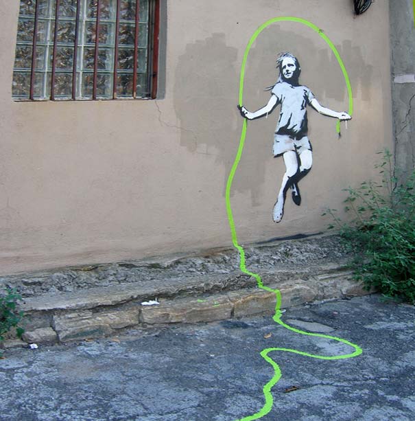
Something like this is colourful in a somewhat dull street and illustrates creativity bursting out, maybe I could work with that concept. That Creativity is busting at the seams and exploding out into the city from all directions. The source = Coca Massey.

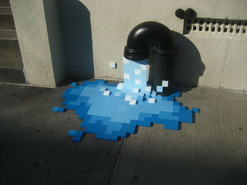
The wellington city (cuba in particular) is often filled with odd and interesting creative endeavors. I'd say that a part of this is due to the city been the canvas on which design students can experiment and play. This cup made me think of Wellington - people love good coffee down here and tea is becoming more and more popular, I could overflow it to show colour seeping into the streets.


shadow play


Instead of just slapping a logo onto the building I want to do something fun and evolving like how I see design.
Sunday, April 10, 2011
further play
Looking at how my logo could come together (different majors all under the design genre). It's also how i originally got my shapes and forms, from circles overlapping each other etc.


Subscribe to:
Posts (Atom)