Tuesday, May 31, 2011

3D - shapes

I need to have 3D shapes in my logo and basically illustrate the movements that I want to use in my building application. This will then be able to show various shapes and forms and no matter how the outdoor area looks like it will basically be like a giant logo. 

I need to bring together some identity guidelines once I get my logo going, and look at what happens when it's paired with the massey logo etc.

Saturday, May 28, 2011

moving along

Moving along to what resembles building blocks in playful colours. Also has the >>> shape with the play button coming through.

Friday, May 27, 2011

Start of the triangle designs

I've been trying to find a way to work triangles facing the 'play button' direction. This is what I have so far.. I think it's kinda hideous! It looks ok below with the massey logo, font probably doesn't work so well? Anyway it doesn't look all that fun and playful, let alone creative. I'll keep trying!

Thursday, May 26, 2011

Magic triangles and cubes


Magic Diamond Cube 5 CM

I want to make a triangle version of the magic square (scroll down and watch the video), a playful fun sort of feature. But back to that later. logo time logo logo logo! 

PLAY!

I've been going round in circles, literally. 


Re-focus = PLAY
The idea I like the most of mine was the designers playground and the emphasis on collaboration, connectivity and interaction. So back to square one where I'm looking at triangles. Why triangles you ask? Because it's more interesting than a square or a circle, and it has straight edges which are easier to work with than curved ones. It's simple, yet not too simple.


A triangle is the shape of a musical instrument, a playful simple one that can be fun.


It comes to a point, creative people always seam to be making a point. 


Triangles can mean different things depending on the proportions and which way they are facing.


And best of all, it's the shape of the play button, which is where my focus is!!! Ta DA making progress in my thinking!


Of course not to be confused with 


Mood board of ideas:

This was my initial inspiration for the designers playground, the movable sections on the wall, I really liked the vibe it had about it. Back to that idea now, time to take it further.


The spiky out bits could be indications of where you pull. They would fold down so seats could be created out of walls when needed or desired. Massey students don't really sit outside much, unless at tussok. I know people are busy in labs and sewing rooms and all the rest, so I wanted to make an outdoor space which can suit anyone depending on how they want to use the space. It will be a movable flexible area which reflects the logo (once I get it done) and which illustrates how the brand is a flexible identity, due to the visual link between the area and the logo. Yes I know I work backwards!  I'll make the area using this sort of idea.. of collapsable movable furniture below.


Modualar theme used due to: The flexible classroom space/interchangeable/movable furniture that claire talked about the new building having. Something to suit different learning styles etc. 


I like this how it's playful, can take many shapes and forms. Could use this sort of idea to create a triangular shaped thing to match logo. Could come with prospectuses for students to make up and play with, emphasizing idea behind logo

Wednesday, May 25, 2011

exp3


Yet another wee experiment. Could move forward with it if I work out how I want the last slide to look and that could be the logo. I could then work with the overlay parts and pull them over top of images etc. Add a variation of colour, I need to check the colour palette thing for massey brand identity and see how that might work etc. Any thoughts or anything just comment below.

circular logo


Another experiment. I was thinking how a the letters fit into the circle (still) and how it could be a light up object which spells out the word coca. Was a bit of fun, need to assess where I'm heading.


A clock my friend was telling me about. The second dial moves and they all move along, otwards the end of the year it would start to make a whole circle. Quite a cool visual for a clock. Matches what I'm doing here.

Circle spinning


I like how the C, O & A of the word coca all seam to fit into a circle shape. I did a wee experiment looking at movement and the way the letters fit into the shape. It's like a flip book. The spine is the centre holding everything together. Could I illustrate this more to show how the building stays and everyone flashes through, moving through. The intersecting space that joins the buildings together on campus. Ah how to show everything I'm thinking in a simple clear way?!

Intersecting


The idea of a round about been a place of intersection, much like the building. Did some scribbles to visualize it. 

This is how people would walk around the building (if it was a round about style object). But it's not..


So by using the building as an intersection joining various blocks together, people travel through more like this.

This illustrates the collaboration and connectivity. 

Inspiration from fabio ongarato


If the above image is a wall and the below image in a bookshelf/library. I could play with the movement of modules to move the wall away piece by piece and have an interactive space that could be utilized in many different ways. Furniture could be formed by pieces... yes but I need a logo!


Fingerprints - identity, individual.


If these stiky outy yellow parts could be moved if you pulled them down, different colours came up. More of a 3-D space could be created.

Tuesday, May 24, 2011

Book folding - play

A library of creativity.

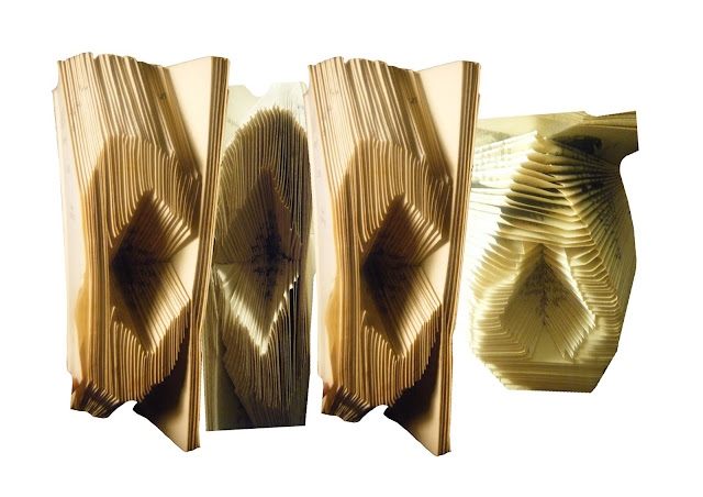
Not really.. It's just what came to mind. I was playing with a book and the way we use it. I put each of the letters into the book through folding. It's playful, and the opposite to how a book is typically used or seen. Designers break boundaries and have a message to say. A book can also be filled with knowledge and we come to university to learn as well. Obviously this isn't a logo yet but I'll play with it now I have it on the computer and see what happens.

Can you make a font out of it? What style does this font portray? A kinds of child like clunky one. Straight in some places, curved and lumpy in others. With a child like feel to it. Like a font that hasn't been fixed up yet, a child font, not yet grown up and perfected. 

I should take some of my previous ideas and bring them in here to give me a sense of where to head next.

My work space


The building should be a place people can work and are inspired when they work in it. So I took a look at my living room where I moved my desk into so I have work space and chill/sleep place (my bedroom). My work space lately has been covered in coloured piles of things to do and when they get done they go below the blue frame pictured here. You can see I've done a lot of work on the paper colour coded as pink, and nothing on yellow, and I didn't even get round to creating the to do list for my third paper. I'm interested in how I work and what is a creative work space. However that could be a whole topic of its own. I need to start playing and getting my logo's sorted eek! Will get some stuff done and up asap so I can get feedback on it. WORK TIME!

Design school visual brainstorm

Design Victoria logo
This is a logo I saw when in Melbourne, it's run through RMIT university (logo pictured below).

In partnership with RMIT University


Click photo to be taken to website with a list of things Graphic Designers say need to be included in courses that currently isn't. Interesting points I could play on.

design exhibition


Friday, May 20, 2011

RMIT uni + Studio Space


 I'm not saying this is how our uni should look, it looks a lot like slime. But the point is that it stands out!

I walked past this studio space in melbourne. Took some photos at night when no-one was around, stalkerish I know. But I was interested to see how it was evident that each person has a work space and displays inspiration and things they are working on in their space. It's interesting to see how people work and to see projects in the middle of them when ideas are still been formed. This new building should incorporate some space, especially for students in their last year. This also  helps the collaboration and cross-pollination of disciplines and interaction of various majors.