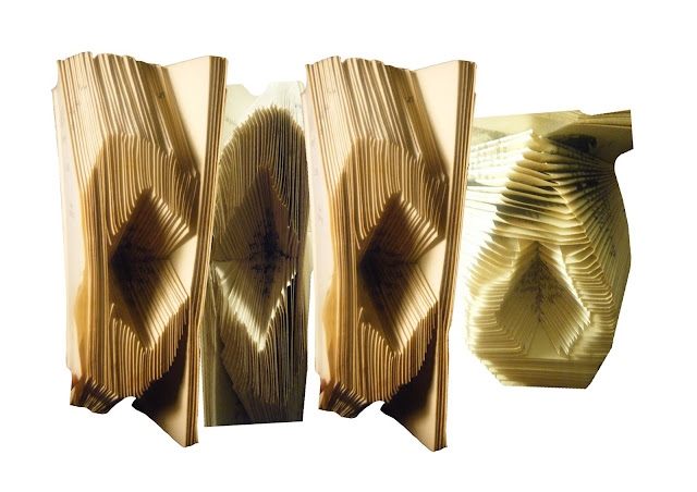
Not really.. It's just what came to mind. I was playing with a book and the way we use it. I put each of the letters into the book through folding. It's playful, and the opposite to how a book is typically used or seen. Designers break boundaries and have a message to say. A book can also be filled with knowledge and we come to university to learn as well. Obviously this isn't a logo yet but I'll play with it now I have it on the computer and see what happens.
Can you make a font out of it? What style does this font portray? A kinds of child like clunky one. Straight in some places, curved and lumpy in others. With a child like feel to it. Like a font that hasn't been fixed up yet, a child font, not yet grown up and perfected.
I should take some of my previous ideas and bring them in here to give me a sense of where to head next.


No comments:
Post a Comment