Claire Robertson - College of Creative Arts
Associate Pro Vice-Chancellor (Business and Operations).
Notes from her talk with us about Massey's branding.
2008 - Massey went through re-branding.
5 colleges
3campuses
+ extramural
+ Research Centers
+ All websites associated with Massey
They felt there needed to be consistency across all areas so that massey was pulled together as 1 unity, this is where the current brand identity and brand guidelines come from.
There are 6 big goals which drive a lot of what Massey Uni do. They have defining pillars - the things which make them distinct and unique compared to the rest of NZ and other design schools internationally. Some of these include: Creativity & Innovation.
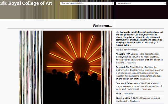
They would like to position themselves along with the best design schools in the world. Such as the Royal College of Art
Already I'm questioning how we are meant to compete with specialist design schools (based on our website). Claire said we are looking at gaining ideally American post grad students. They can't exactly visit Massey before they come so their idea of Massey is based on what? Our website, previous students account of the uni who may be from America. Or from their impression of Massey throughout the web such as the best awards etc. I'd say looking to go overseas would be a bit of a task, you want it to be an easy choice and be sure that the place your are planning on studying for a couple of years half way across the world can offer you what you really want. We need to make sure this is accurately portrayed in various ways.
The Front page of this website (from Canbrook) straight away is exciting and the movement of the curser over the images causes it to change as seen above. For anyone weather they be interested in architecture or interactive design it's a sign of a website which reflects what goes on within the design school it's self. We have a generic website which doesn't reflect the college of creative arts, nor does our logo and nor do our buildings... We have a lot to do!!!!
This website gave me a shock. My impression of Yale was prim and proper and I was expecting something boring, or typographically professional looking. This has wee boats that flicker as if they were moving all around, people jumping out of boats and fish swimming. Quite different!
So what do Coca Massey want to do?
"Embody or represent those qualities of been an international Art Education Provider".
The Creative Arts Institution is allowed to have their own brand guidelines etc. They are after a distinct brand identity of their own. Something that still sits underneath the Massey University umbrella but is unique and reflects our school for what it really is.
There's always tensions between looking creative and acknowledging the rest of the University, that is after-all where our money comes from. We can't really be an entirely/perfectly independent brand.
Coca tend to set the way for the rest of the University. They battle to eg. get pictures of people in their prospectuses and before too long the rest of the colleges ask for the same because they see what coca got to do. I guess coca would like to portray themselves like that too. First, doing something different from the status quo.


No comments:
Post a Comment