"The Chase developed a name and identity for a pioneering furniture retail business set up by Merseystride. The social enterprise buys returned, end-of-the-line and slightly damaged furniture from catalogue companies, repairing them on site and selling them for a reduced price. The awards judges were impressed by the grounded initiative, with the name Home representing the dual aspect of the enterprise – it is both a furniture shop and helps the homeless find accommodation. A simple graphic style was developed across cardboard boxes for the flat-pack furniture, which also became promotional material." - Benchmark awards 2010 (best in brand communication) BEST OF SHOW PROGRAMS WINNER!
"Love’s challenge was to refocus the Umbro brand, following its acquisition by Nike. The overhaul saw Umbro re-established as a brand for modern football culture, amplifying the company’s heritage across multiple channels and touchpoints. The judges found excellence in the overall quality and attention to detail, with the brand communicated across the interiors of Umbro’s global headquarters and through to swing tickets, button bags and product catalogues." - Benchmark Awards 2010 BEST OF SHOW PROGRAMS RUNNER UP
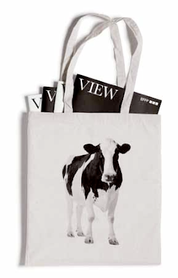
"English Farming and Food Partnerships strives to build bonds between the agricultural and food industries, to make both more efficient. Purpose worked closely with EFFP to help differentiate it from other organisations in the sector, creating a bold black-and-white identity. This was applied to all marketing collateral, the website and EFFP’s magazine View." - Benchmark Awards 2010 BEST OF SHOW PROGRAMS RUNNER UP
"Deloitte needed an identity to unify its 140 independent member firms behind their first-ever global advertising campaign, which aimed to unite them all. The Partners made Deloitte’s recognisable symbol, the green dot in its logo, the hero of the campaign. This simple approach conveyed a clear point of view on business and society, using the green-dot icon to help interpret any subject. A black canvas was used across marketing collateral, with the green dot being the only colour employed in the campaign."- Benchmark Awards 2010 COMMENDED FINANCIAL SERVICES CAMPAIGN.


No comments:
Post a Comment